Measured entry
ruixen-breadcrumb-separator
A client-side React breadcrumb that accepts an item list and a separator style, then adds a hover cascade that fades later crumbs and enlarges the adjacent divider. It ships as a shadcn registry component, uses Tailwind utility classes, and expects the standard cn helper backed by clsx and tailwind-merge; lucide-react is declared but the chevron is drawn inline.
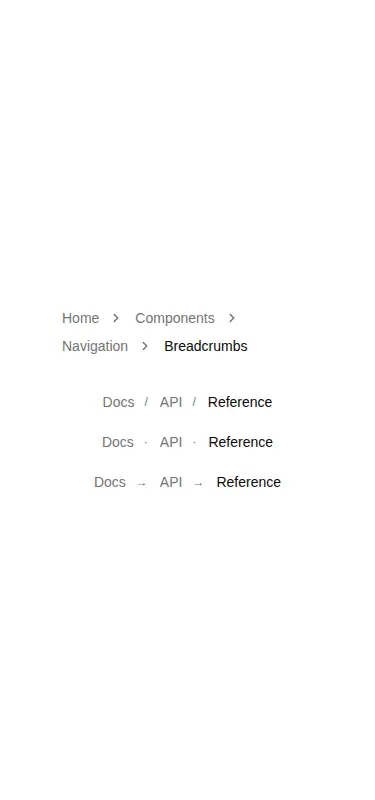
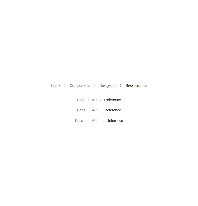
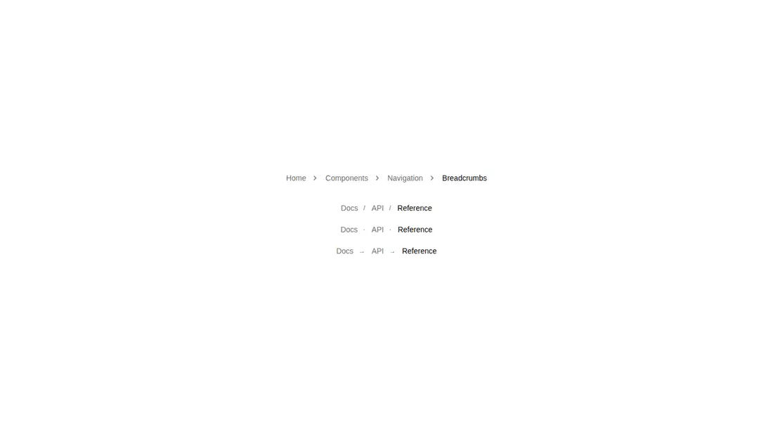
Measured
Every value below was written by the harness on the run that produced the frames above. None of it is derived from the prose.
| Build | OK |
|---|---|
| Mount | OK |
| Console errors | 0 |
| Uncaught page errors | 0 |
| Horizontal overflow | clean at 375, 768, 1440 |
| Axe critical | 0 |
| Axe serious | 0 |
| Axe moderate | 1 |
| Axe minor | 0 |
| Gzip marginal | 30.0 KB (95.5 KB build, 65.5 KB baseline) |
| Bare mode | FAIL |
| Provider required | NO |
| Demo used | written from the component source API |
What the harness recorded
BARE BUILD
✗ Build failed in 1m 19s
error during build:
[vite:load-fallback] Could not load <sandbox>/src/lib/utils (imported by src/cut/components/ruixen/breadcrumb-separator.tsx): ENOENT: no such file or directory, open '<sandbox>/src/lib/utils'
Verdict
A tidy choice for shadcn-based navigation when the hover cascade suits the product. It builds and mounts in the prepared harness, but bare mounting fails because the cn import is unresolved, so it needs a shadcn-style setup. Add configurable landmark labeling before repeating it on one page.
Use it if
- You want a compact breadcrumb with selectable chevron, slash, dot, arrow, or dash separators.
- Your navigation benefits from a subtle pointer-hover cue showing which later path segments would be left behind.
- Your app already uses shadcn conventions, Tailwind theme tokens, and the cn utility.
Skip it if
- You need several breadcrumb landmarks on one page with distinct accessible names, because the label is fixed in the component.
- You require motion to follow reduced-motion preferences, because its inline hover transitions do not provide that accommodation.
- You want a dependency-light, plain CSS component without Tailwind aliases or shadcn project conventions.
Install
| Declared dependencies | lucide-react, clsx, tailwind-merge |
|---|---|
| Missing on install | none |
| Bare install | fails once the shadcn-style helpers are removed, so it needs that setup |
| Provider | no provider required in the harness |
In a non-shadcn project, add Tailwind with foreground and muted-foreground theme utilities, configure the at-sign source alias, provide lib/utils with a cn helper using clsx and tailwind-merge, and install the registry-declared lucide-react package even though this source renders its chevron inline.
Source and credit
This page is a review, not a copy. The component source lives with its author and this site does not republish it. Read the license before you use anything.
Author repository
github.com/ruixenui/ruixen.comAlternatives
Other published entries for the navbar pattern, ordered by what they measured: mounts first, then clean axe scans, then bare-mode passes, then the smaller bundle.
- hyperui-headers-4editorial
- Renders
- YES
- A11y
- 0
- Gzip
- 19.1KB
- Bare
- pass
- Prov
- NO
- kibo-dialog-stackminimal-flat
- Renders
- YES
- A11y
- 0
- Gzip
- 33.4KB
- Bare
- pass
- Prov
- NO
- ruixen-floating-navbarunclassified
- Renders
- YES
- A11y
- 0
- Gzip
- 59.9KB
- Bare
- pass
- Prov
- NO
- ruixen-hover-gradient-navbargradient-glow
- Renders
- YES
- A11y
- 0
- Gzip
- 60.9KB
- Bare
- pass
- Prov
- NO
- ruixen-expandable-menu-navbarunclassified
- Renders
- YES
- A11y
- 0
- Gzip
- 61.8KB
- Bare
- pass
- Prov
- NO
- hextaui-cardminimal-flat
- Renders
- YES
- A11y
- 0
- Gzip
- 26.7KB
- Bare
- fail
- Prov
- NO