Measured entry
ruixen-button-dropdown
buttonliquid-glassmotion on file
A client-side React action dropdown styled as a liquid-glass pill. It ships as a single registry component with inline theme CSS, uses Motion for the trigger and menu transitions, and can create click feedback through the browser Web Audio API. It does not rely on shadcn primitives or a provider.

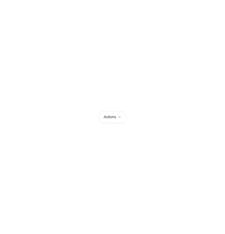
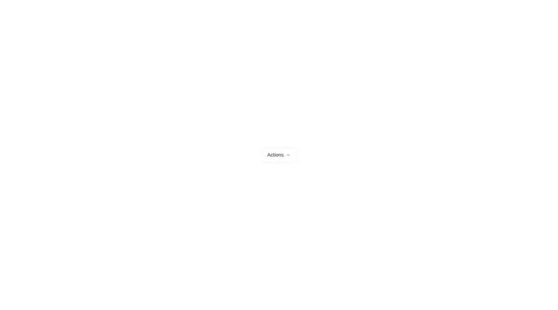
Measured
Every value below was written by the harness on the run that produced the frames above. None of it is derived from the prose.
| Build | OK |
|---|---|
| Mount | OK |
| Console errors | 0 |
| Uncaught page errors | 0 |
| Horizontal overflow | clean at 375, 768, 1440 |
| Axe critical | 0 |
| Axe serious | 0 |
| Axe moderate | 0 |
| Axe minor | 0 |
| Gzip marginal | 63.7 KB (129.2 KB build, 65.5 KB baseline) |
| Bare mode | OK |
| Provider required | NO |
| Demo used | written from the component source API |
Verdict
A polished fit for short, low-risk action lists when its visual style and Motion dependency are already welcome. It mounts without shadcn infrastructure, but teams with strict keyboard and screen-reader requirements should add proper menu behavior before shipping it.
Use it if
- You need a compact action menu with animated opening, outside-click dismissal, and Escape handling.
- Your interface already uses Motion and the liquid-glass treatment fits its visual language.
- You want optional click sounds and can disable them where audio feedback is inappropriate.
Skip it if
- You need full menu semantics, arrow-key navigation, focus management, or explicit expanded-state attributes.
- You want to avoid adding Motion for one small control.
- Your design system forbids component-level style injection or browser-generated sound by default.
- You need long or dynamic menus with stable item identities because entries are keyed by position.
Install
| Declared dependencies | motion |
|---|---|
| Missing on install | none |
| Bare install | builds and mounts without the shadcn-style helpers |
| Provider | no provider required in the harness |
In a non-shadcn React project, add Motion, copy the client component into your source tree, and ensure your framework supports client components and browser APIs. No Tailwind setup, shadcn primitive, or context provider is required. Disable the sound prop if the product should not create audio feedback.
Source and credit
This page is a review, not a copy. The component source lives with its author and this site does not republish it. Read the license before you use anything.
Author repository
github.com/ruixenui/ruixen.comAlternatives
Other published entries for the button pattern, ordered by what they measured: mounts first, then clean axe scans, then bare-mode passes, then the smaller bundle.
- neu-buttonneumorphism
- Renders
- YES
- A11y
- 0
- Gzip
- 17.8KB
- Bare
- pass
- Prov
- NO
- clay-buttonclaymorphism
- Renders
- YES
- A11y
- 0
- Gzip
- 18.2KB
- Bare
- pass
- Prov
- NO
- tripled-animated-radio-shadcnuiminimal-flat
- Renders
- YES
- A11y
- 0
- Gzip
- 58.2KB
- Bare
- pass
- Prov
- NO
- ruixen-glow-link-buttonliquid-glass
- Renders
- YES
- A11y
- 0
- Gzip
- 58.9KB
- Bare
- pass
- Prov
- NO
- tripled-mood-gradient-button-shadcnuigradient-glow
- Renders
- YES
- A11y
- 0
- Gzip
- 59.2KB
- Bare
- pass
- Prov
- NO
- ruixen-glass-ai-cardliquid-glass
- Renders
- YES
- A11y
- 0
- Gzip
- 59.5KB
- Bare
- pass
- Prov
- NO