Measured entry
ruixen-button-split
buttonliquid-glassmotion on file
A client-side React split button with a primary action, an animated options menu, liquid-glass styling injected by the component, and optional click sounds through the Web Audio API. It ships as a registry TSX file and depends on Motion, but not on shared shadcn components or a provider.

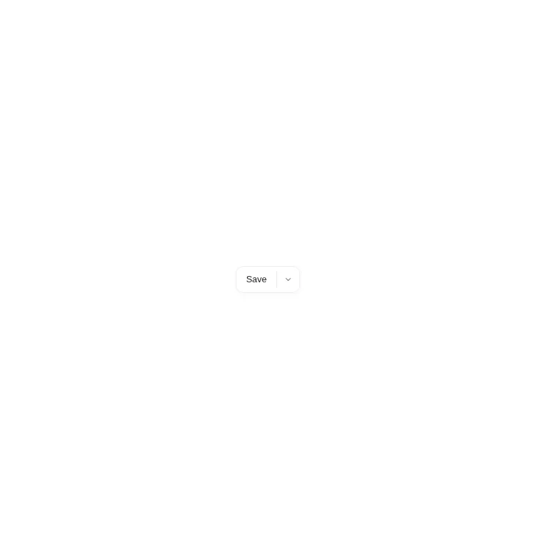
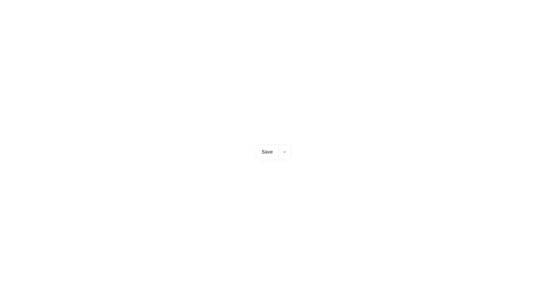
Measured
Every value below was written by the harness on the run that produced the frames above. None of it is derived from the prose.
| Build | OK |
|---|---|
| Mount | OK |
| Console errors | 0 |
| Uncaught page errors | 0 |
| Horizontal overflow | clean at 375, 768, 1440 |
| Axe critical | 1 |
| Axe serious | 0 |
| Axe moderate | 0 |
| Axe minor | 0 |
| Gzip marginal | 63.7 KB (129.2 KB build, 65.5 KB baseline) |
| Bare mode | OK |
| Provider required | NO |
| Demo used | written from the component source API |
Verdict
The interaction is compact and the component builds and mounts without shadcn infrastructure, but it is not ready unchanged. The icon-only menu trigger lacks an accessible name, and blank wider captures warrant layout investigation before adoption.
Use it if
- You need one prominent action with a short list of closely related alternatives.
- You want a self-contained glass-styled control that supports light and dark theme selectors.
- Your client-rendered React app already uses Motion or can accept that dependency.
Skip it if
- You need production-ready keyboard and screen-reader behavior without modifying the component.
- Your design system avoids inline injected CSS, inline styles, or browser-generated interaction sounds.
- You need confidence across wider layouts, since the wider harness captures were blank.
Install
| Declared dependencies | motion |
|---|---|
| Missing on install | none |
| Bare install | builds and mounts without the shadcn-style helpers |
| Provider | no provider required in the harness |
Add Motion, place the TSX file in a client-rendered React project, and ensure the browser build supports the Web Audio API. No shadcn utilities or provider are required. Add an accessible label and consider disabling the default sound before release.
Source and credit
This page is a review, not a copy. The component source lives with its author and this site does not republish it. Read the license before you use anything.
Author repository
github.com/ruixenui/ruixen.comAlternatives
Other published entries for the button pattern, ordered by what they measured: mounts first, then clean axe scans, then bare-mode passes, then the smaller bundle.
- neu-buttonneumorphism
- Renders
- YES
- A11y
- 0
- Gzip
- 17.8KB
- Bare
- pass
- Prov
- NO
- clay-buttonclaymorphism
- Renders
- YES
- A11y
- 0
- Gzip
- 18.2KB
- Bare
- pass
- Prov
- NO
- tripled-animated-radio-shadcnuiminimal-flat
- Renders
- YES
- A11y
- 0
- Gzip
- 58.2KB
- Bare
- pass
- Prov
- NO
- ruixen-glow-link-buttonliquid-glass
- Renders
- YES
- A11y
- 0
- Gzip
- 58.9KB
- Bare
- pass
- Prov
- NO
- tripled-mood-gradient-button-shadcnuigradient-glow
- Renders
- YES
- A11y
- 0
- Gzip
- 59.2KB
- Bare
- pass
- Prov
- NO
- ruixen-glass-ai-cardliquid-glass
- Renders
- YES
- A11y
- 0
- Gzip
- 59.5KB
- Bare
- pass
- Prov
- NO