Measured entry
ruixen-corporate-footer
A client-side React corporate footer presented as an inset card, with a brand block, configurable navigation columns, optional social icons, and a decorative SVG watermark. It ships as a shadcn registry item but has no registry dependencies; the source relies on React, Next.js Link, Tailwind utilities, and theme color tokens.
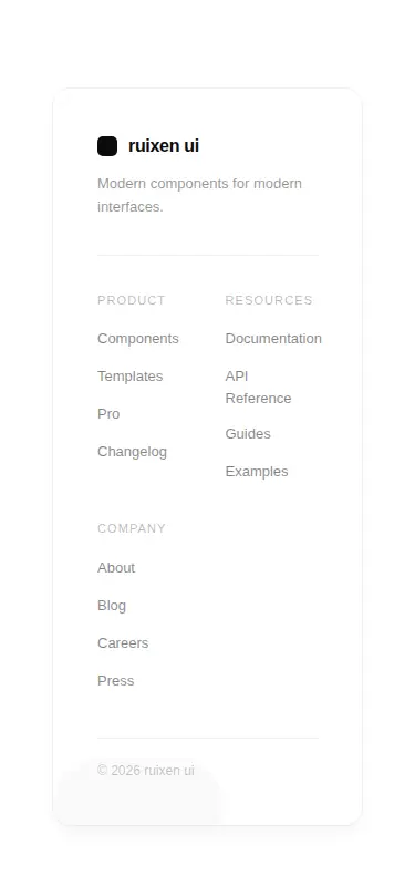
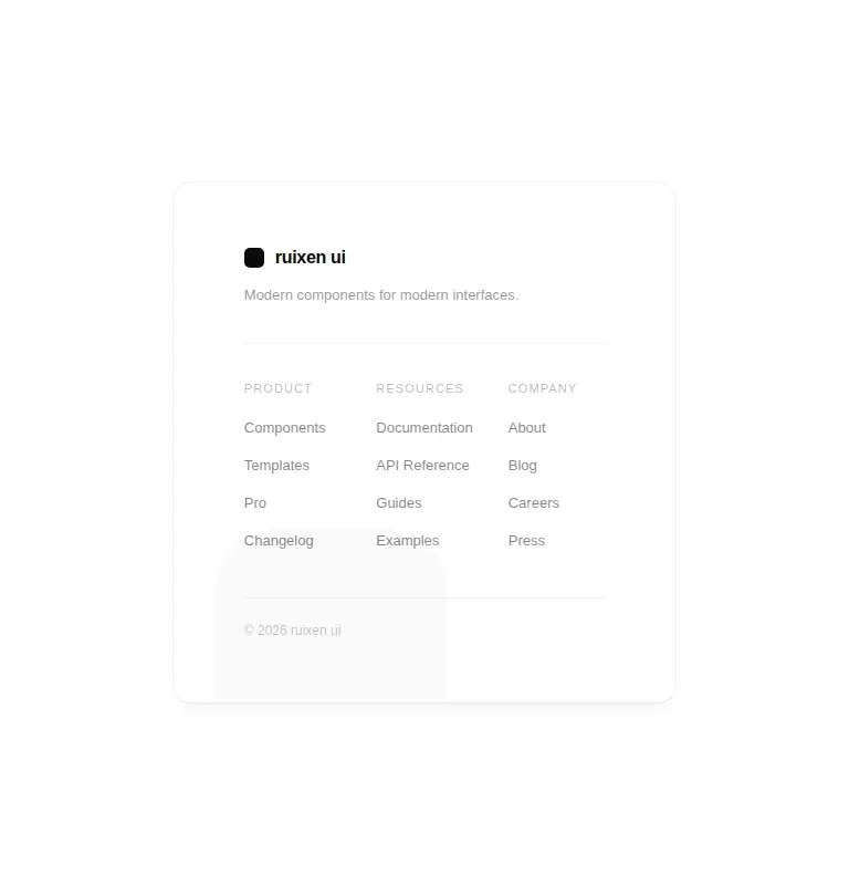
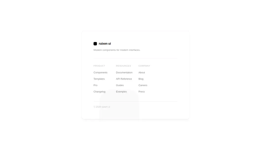
Measured
Every value below was written by the harness on the run that produced the frames above. None of it is derived from the prose.
| Build | OK |
|---|---|
| Mount | OK |
| Console errors | 0 |
| Uncaught page errors | 0 |
| Horizontal overflow | clean at 375, 768, 1440 |
| Axe critical | 0 |
| Axe serious | 1 |
| Axe moderate | 0 |
| Axe minor | 0 |
| Gzip marginal | 35.1 KB (100.5 KB build, 65.4 KB baseline) |
| Bare mode | OK |
| Provider required | NO |
| Demo used | written from the component source API |
Verdict
A tidy responsive starting point that runs without provider or shadcn machinery, but do not ship its default palette: muted navigation, labels, and copyright text trigger a serious contrast violation. Use it only if you will retune the colors and replace the placeholder links.
Use it if
- You want a compact, card-style footer for a product or company landing page.
- Your project already uses Next.js and Tailwind theme tokens.
- You need configurable navigation columns and optional icon-based social links.
Skip it if
- You need an accessible default palette without revising muted text colors.
- Your design calls for a conventional full-width footer rather than an inset card.
- You are not using Next.js and do not want to replace its Link component.
- You require semantic headings for each navigation group out of the box.
Install
| Declared dependencies | none declared |
|---|---|
| Missing on install | none |
| Bare install | builds and mounts without the shadcn-style helpers |
| Provider | no provider required in the harness |
In a non-shadcn project, add React and Tailwind, define the background, card, foreground, muted foreground, and border theme tokens used by the classes, and provide Next.js Link or swap it for your router's link component. No extra package or provider is required.
Source and credit
This page is a review, not a copy. The component source lives with its author and this site does not republish it. Read the license before you use anything.
Author repository
github.com/ruixenui/ruixen.comAlternatives
Other published entries for the navbar pattern, ordered by what they measured: mounts first, then clean axe scans, then bare-mode passes, then the smaller bundle.
- hyperui-headers-4editorial
- Renders
- YES
- A11y
- 0
- Gzip
- 19.1KB
- Bare
- pass
- Prov
- NO
- kibo-dialog-stackminimal-flat
- Renders
- YES
- A11y
- 0
- Gzip
- 33.4KB
- Bare
- pass
- Prov
- NO
- ruixen-floating-navbarunclassified
- Renders
- YES
- A11y
- 0
- Gzip
- 59.9KB
- Bare
- pass
- Prov
- NO
- ruixen-hover-gradient-navbargradient-glow
- Renders
- YES
- A11y
- 0
- Gzip
- 60.9KB
- Bare
- pass
- Prov
- NO
- ruixen-expandable-menu-navbarunclassified
- Renders
- YES
- A11y
- 0
- Gzip
- 61.8KB
- Bare
- pass
- Prov
- NO
- hextaui-cardminimal-flat
- Renders
- YES
- A11y
- 0
- Gzip
- 26.7KB
- Bare
- fail
- Prov
- NO