Measured entry
ruixen-credit-card-dialog
dialogunclassifiedmotion on file
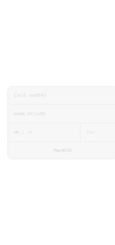
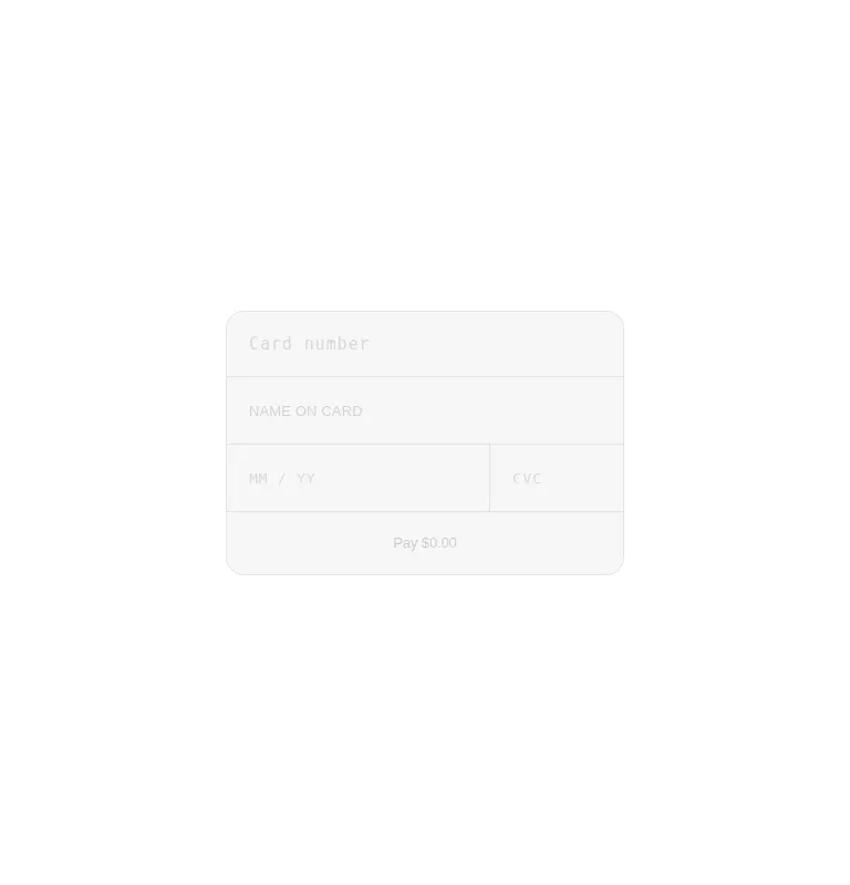
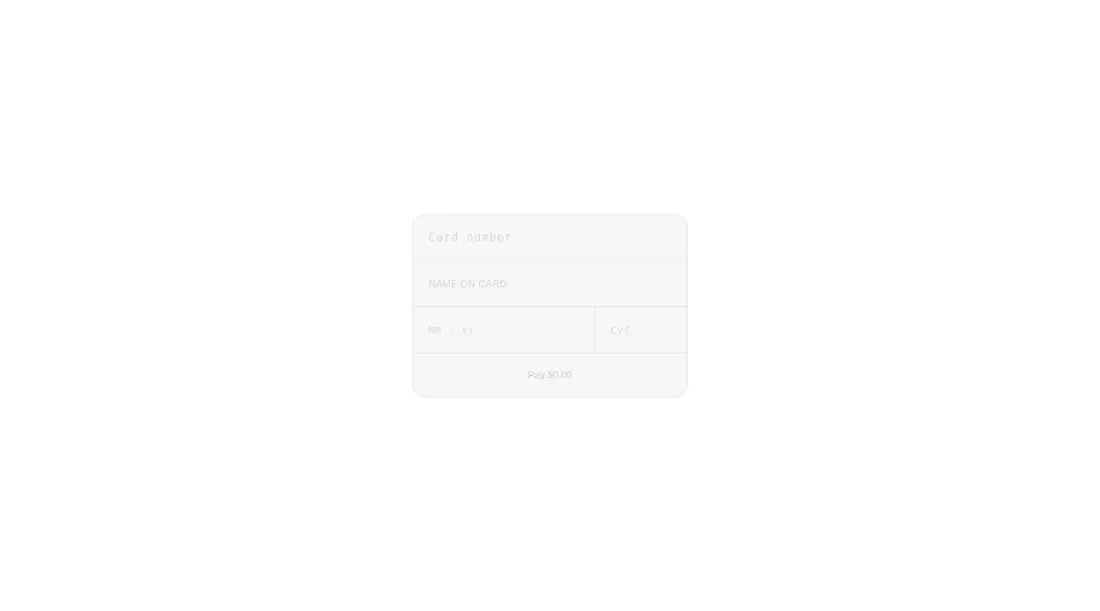
A client-side React payment-card form distributed through a shadcn registry. It is an inline panel, not an actual modal dialog, with built-in formatting, card-brand detection, focus advancement, and optional Web Audio key ticks. Styling is mostly inline, with a Tailwind placeholder utility and no third-party runtime package beyond React.
Measured
Every value below was written by the harness on the run that produced the frames above. None of it is derived from the prose.
| Build | OK |
|---|---|
| Mount | OK |
| Console errors | 0 |
| Uncaught page errors | 0 |
| Horizontal overflow | flagged at 375 |
| Axe critical | 0 |
| Axe serious | 1 |
| Axe moderate | 0 |
| Axe minor | 0 |
| Gzip marginal | 19.2 KB (84.6 KB build, 65.4 KB baseline) |
| Bare mode | OK |
| Provider required | NO |
| Demo used | written from the component source API |
Verdict
Useful as a polished interaction prototype, but misleadingly named: it is an inline card form rather than a dialog. It mounts without framework scaffolding, yet the fixed sizing, low-contrast text, placeholder-only labeling, and raw-card callback make it a poor production checkout until substantially hardened.
Use it if
- You need an embedded card-entry prototype and will connect the submission callback to your own payment flow.
- You want card formatting, basic brand recognition, autofill hints, and automatic focus progression in a compact panel.
- Your team can revise the responsive sizing, contrast, labels, and payment-security integration before production.
Skip it if
- You need a true modal with a trigger, backdrop, focus trap, escape handling, and dialog semantics.
- You need a production-ready checkout that tokenizes card data through hosted fields instead of returning raw card details to application code.
- You must support narrow mobile layouts without modification; the fixed-width panel overflowed in the compact viewport.
- You require accessible defaults; the muted text failed contrast checks, and the inputs rely on placeholders instead of persistent labels.
Install
| Declared dependencies | none declared |
|---|---|
| Missing on install | none |
| Bare install | builds and mounts without the shadcn-style helpers |
| Provider | no provider required in the harness |
Copy the client component into a React app, retain its inline styles, and either configure Tailwind for the placeholder utility or replace that class with ordinary CSS. No provider or extra package is required. Add responsive width rules, accessible labels and focus styles, and a payment processor's hosted or tokenized fields before real use.
Source and credit
This page is a review, not a copy. The component source lives with its author and this site does not republish it. Read the license before you use anything.
Author repository
github.com/ruixenui/ruixen.comAlternatives
Other published entries for the dialog pattern, ordered by what they measured: mounts first, then clean axe scans, then bare-mode passes, then the smaller bundle.
- shadcn-dialogunclassified
- Renders
- YES
- A11y
- 0
- Gzip
- 26.7KB
- Bare
- fail
- Prov
- NO
- 8bitcn-dialogueskeuomorphism
- Renders
- YES
- A11y
- 0
- Gzip
- 34.2KB
- Bare
- fail
- Prov
- NO
- neobrutalism-dialogbrutalism
- Renders
- YES
- A11y
- 0
- Gzip
- 40.5KB
- Bare
- fail
- Prov
- NO
- neobrutalism-ndialogbrutalism
- Renders
- YES
- A11y
- 0
- Gzip
- 40.5KB
- Bare
- fail
- Prov
- NO
- neobrutalism-alert-dialogbrutalism
- Renders
- YES
- A11y
- 0
- Gzip
- 40.7KB
- Bare
- fail
- Prov
- NO
- shadcn-alert-dialogunclassified
- Renders
- YES
- A11y
- 0
- Gzip
- 41.5KB
- Bare
- fail
- Prov
- NO