Measured entry
ruixen-gooey-pagination
navbarliquid-glassmotion on file
A client-side React pagination control shipped as a shadcn registry item. It renders inline-styled glass dots with an SVG goo filter, animates the active marker through motion/react, keeps page state internally, and can emit an optional Web Audio tick.

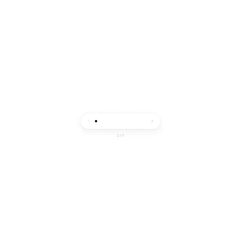
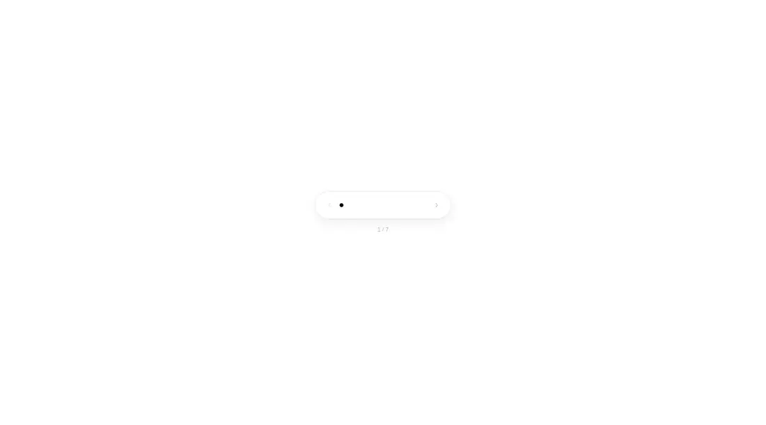
Measured
Every value below was written by the harness on the run that produced the frames above. None of it is derived from the prose.
| Build | OK |
|---|---|
| Mount | OK |
| Console errors | 0 |
| Uncaught page errors | 0 |
| Horizontal overflow | clean at 375, 768, 1440 |
| Axe critical | 1 |
| Axe serious | 1 |
| Axe moderate | 0 |
| Axe minor | 0 |
| Gzip marginal | 62.2 KB (127.7 KB build, 65.5 KB baseline) |
| Bare mode | OK |
| Provider required | NO |
| Demo used | written from the component source API |
Verdict
Visually distinctive and easy to drop into React, but not production-ready as navigation. The harness mounted it, yet wider captures were blank, and the source leaves arrow buttons unnamed and page dots outside keyboard semantics. Use it only after accessibility work and responsive investigation.
Use it if
- You need a compact, decorative paginator for a small set of pages.
- Your integration can consume a zero-based change callback while the component owns the active page state.
- You want styling that is contained in the component and does not require a theme provider or shared utility layer.
Skip it if
- You need production-ready accessible navigation without modification, since the arrow buttons lack names and the dot targets are not keyboard controls.
- You need controlled pagination tied directly to routing or external state, since there is no current-page prop.
- You cannot investigate viewport-specific rendering, since the harness produced blank wider captures despite a successful mount.
- Your dependency policy excludes Motion or optional browser-generated interaction sounds.
Install
| Declared dependencies | motion |
|---|---|
| Missing on install | none |
| Bare install | builds and mounts without the shadcn-style helpers |
| Provider | no provider required in the harness |
In a non-shadcn app, copy the TSX component into a client-rendered React module, install Motion, and ensure the bundler supports motion/react. No provider or shared utility layer is required. Add accessible names, keyboard-capable page controls, visible focus treatment, and suitable contrast before release.
Source and credit
This page is a review, not a copy. The component source lives with its author and this site does not republish it. Read the license before you use anything.
Author repository
github.com/ruixenui/ruixen.comAlternatives
Other published entries for the navbar pattern, ordered by what they measured: mounts first, then clean axe scans, then bare-mode passes, then the smaller bundle.
- hyperui-headers-4editorial
- Renders
- YES
- A11y
- 0
- Gzip
- 19.1KB
- Bare
- pass
- Prov
- NO
- kibo-dialog-stackminimal-flat
- Renders
- YES
- A11y
- 0
- Gzip
- 33.4KB
- Bare
- pass
- Prov
- NO
- ruixen-floating-navbarunclassified
- Renders
- YES
- A11y
- 0
- Gzip
- 59.9KB
- Bare
- pass
- Prov
- NO
- ruixen-hover-gradient-navbargradient-glow
- Renders
- YES
- A11y
- 0
- Gzip
- 60.9KB
- Bare
- pass
- Prov
- NO
- ruixen-expandable-menu-navbarunclassified
- Renders
- YES
- A11y
- 0
- Gzip
- 61.8KB
- Bare
- pass
- Prov
- NO
- hextaui-cardminimal-flat
- Renders
- YES
- A11y
- 0
- Gzip
- 26.7KB
- Bare
- fail
- Prov
- NO