Measured entry
ruixen-icon-label-subtext-button
buttonliquid-glassmotion on file
A client-side React action button that pairs an icon with a label and optional supporting text. It ships as a shadcn registry file but is self-contained, injecting its own light and dark glass styles. Motion supplies hover and press animation, while the browser Web Audio API provides an optional click sound that is enabled by default.
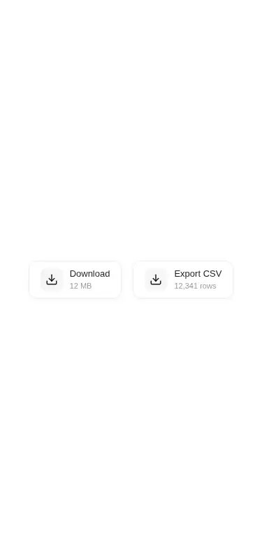
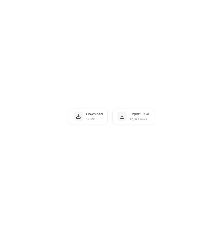
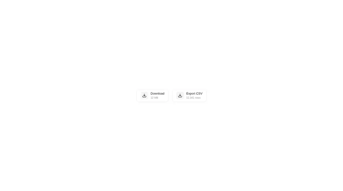
Measured
Every value below was written by the harness on the run that produced the frames above. None of it is derived from the prose.
| Build | OK |
|---|---|
| Mount | OK |
| Console errors | 0 |
| Uncaught page errors | 0 |
| Horizontal overflow | clean at 375, 768, 1440 |
| Axe critical | 0 |
| Axe serious | 0 |
| Axe moderate | 0 |
| Axe minor | 0 |
| Gzip marginal | 61.8 KB (127.3 KB build, 65.5 KB baseline) |
| Bare mode | OK |
| Provider required | NO |
| Demo used | written from the component source API |
Verdict
A polished fit for a small set of download-style actions, and it builds and mounts without shadcn infrastructure. The default sound, absent focus treatment, limited native button props, and sizeable animation dependency make it a component to adapt before broad production use.
Use it if
- You need a compact download or export action that shows useful metadata beneath its label.
- Your React interface already uses Motion and suits a soft glass treatment.
- You want an animated button that can be dropped in without a shared component utility layer.
Skip it if
- You need standard button props such as disabled, form type, keyboard focus styling, or arbitrary accessibility attributes.
- Unexpected interface sounds would be inappropriate and you do not want to opt out on every instance.
- You want to avoid adding Motion for a small interaction or require styling controlled entirely by your design system.
- You render many instances and do not want each one injecting the same style block.
Install
| Declared dependencies | motion |
|---|---|
| Missing on install | none |
| Bare install | builds and mounts without the shadcn-style helpers |
| Provider | no provider required in the harness |
In a non-shadcn React project, add Motion, copy the component into a client-rendered module, and ensure your bundler supports the client directive. No provider or shared utility helper is required. Pass sound as false where audio feedback is unwanted, and add native button props and visible focus styles if your product requires them.
Source and credit
This page is a review, not a copy. The component source lives with its author and this site does not republish it. Read the license before you use anything.
Author repository
github.com/ruixenui/ruixen.comAlternatives
Other published entries for the button pattern, ordered by what they measured: mounts first, then clean axe scans, then bare-mode passes, then the smaller bundle.
- neu-buttonneumorphism
- Renders
- YES
- A11y
- 0
- Gzip
- 17.8KB
- Bare
- pass
- Prov
- NO
- clay-buttonclaymorphism
- Renders
- YES
- A11y
- 0
- Gzip
- 18.2KB
- Bare
- pass
- Prov
- NO
- tripled-animated-radio-shadcnuiminimal-flat
- Renders
- YES
- A11y
- 0
- Gzip
- 58.2KB
- Bare
- pass
- Prov
- NO
- ruixen-glow-link-buttonliquid-glass
- Renders
- YES
- A11y
- 0
- Gzip
- 58.9KB
- Bare
- pass
- Prov
- NO
- tripled-mood-gradient-button-shadcnuigradient-glow
- Renders
- YES
- A11y
- 0
- Gzip
- 59.2KB
- Bare
- pass
- Prov
- NO
- ruixen-glass-ai-cardliquid-glass
- Renders
- YES
- A11y
- 0
- Gzip
- 59.5KB
- Bare
- pass
- Prov
- NO