Measured entry
ruixen-icon-pagination
navbarunclassifiedmotion on file
A compact React client component that presents pagination as colored dots with previous and next arrows, a current-page label, spring movement, and optional click audio. It ships as a shadcn registry TSX file, uses inline styles and browser audio APIs, and depends on Motion for animation.

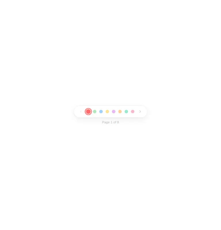
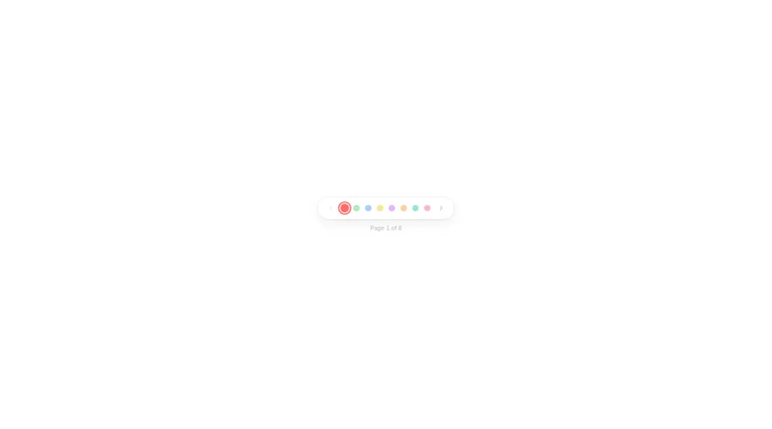
Measured
Every value below was written by the harness on the run that produced the frames above. None of it is derived from the prose.
| Build | OK |
|---|---|
| Mount | OK |
| Console errors | 0 |
| Uncaught page errors | 0 |
| Horizontal overflow | clean at 375, 768, 1440 |
| Axe critical | 1 |
| Axe serious | 1 |
| Axe moderate | 0 |
| Axe minor | 0 |
| Gzip marginal | 59.4 KB (124.8 KB build, 65.4 KB baseline) |
| Bare mode | OK |
| Provider required | NO |
| Demo used | written from the component source API |
Verdict
Visually distinctive and easy to drop into React, but not ready for an accessibility-conscious release. Use it for a small, expressive sequence only after labeling every control, improving text contrast, and checking keyboard and touch behavior.
Use it if
- You need a compact paginator for a carousel, gallery, or short sequence where the page label supplies context.
- You want pointer-proximity animation and optional audio feedback as part of the interaction.
- You prefer a self-contained component whose colors, layout, and dark-theme handling live in the source file.
Skip it if
- You need accessible controls without first adding names to every arrow and dot button and correcting the low-contrast label.
- Users must jump reliably among many pages, because the colored dots do not expose page meaning visually.
- You want a lightweight static paginator and do not otherwise need Motion.
- Your interface should avoid decorative sound or hover behavior that has no equivalent for keyboard and touch users.
Install
| Declared dependencies | motion |
|---|---|
| Missing on install | none |
| Bare install | builds and mounts without the shadcn-style helpers |
| Provider | no provider required in the harness |
In a non-shadcn project, copy the TSX component into your client-side React source, install Motion, and ensure your framework supports client components. No provider or shared utility layer is required. Add accessible names to the icon and dot buttons, strengthen the label contrast, and disable sound if it does not fit your product.
Source and credit
This page is a review, not a copy. The component source lives with its author and this site does not republish it. Read the license before you use anything.
Author repository
github.com/ruixenui/ruixen.comAlternatives
Other published entries for the navbar pattern, ordered by what they measured: mounts first, then clean axe scans, then bare-mode passes, then the smaller bundle.
- hyperui-headers-4editorial
- Renders
- YES
- A11y
- 0
- Gzip
- 19.1KB
- Bare
- pass
- Prov
- NO
- kibo-dialog-stackminimal-flat
- Renders
- YES
- A11y
- 0
- Gzip
- 33.4KB
- Bare
- pass
- Prov
- NO
- ruixen-floating-navbarunclassified
- Renders
- YES
- A11y
- 0
- Gzip
- 59.9KB
- Bare
- pass
- Prov
- NO
- ruixen-hover-gradient-navbargradient-glow
- Renders
- YES
- A11y
- 0
- Gzip
- 60.9KB
- Bare
- pass
- Prov
- NO
- ruixen-expandable-menu-navbarunclassified
- Renders
- YES
- A11y
- 0
- Gzip
- 61.8KB
- Bare
- pass
- Prov
- NO
- hextaui-cardminimal-flat
- Renders
- YES
- A11y
- 0
- Gzip
- 26.7KB
- Bare
- fail
- Prov
- NO