Measured entry
ruixen-scroll-pagination
navbarunclassifiedmotion on file
A compact, internally stateful page selector with arrow buttons, wheel navigation, an animated counter, a progress track, and optional synthesized tick audio. It ships as a client-side TSX registry component, keeps its visual CSS inline, and depends on React, Motion, and browser audio APIs.


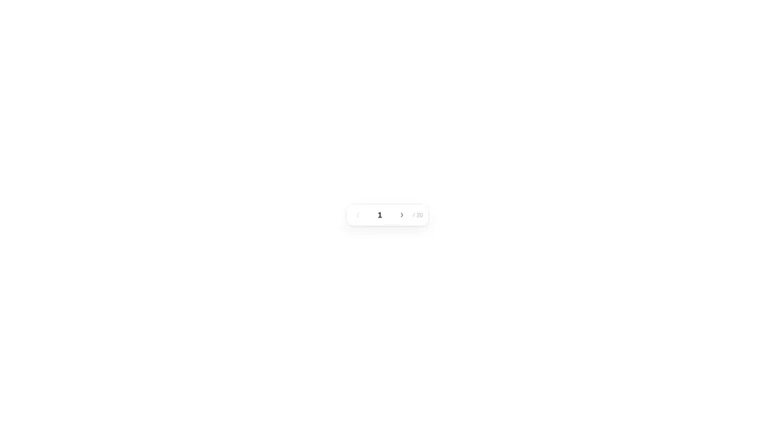
Measured
Every value below was written by the harness on the run that produced the frames above. None of it is derived from the prose.
| Build | OK |
|---|---|
| Mount | OK |
| Console errors | 0 |
| Uncaught page errors | 0 |
| Horizontal overflow | clean at 375, 768, 1440 |
| Axe critical | 1 |
| Axe serious | 1 |
| Axe moderate | 0 |
| Axe minor | 0 |
| Gzip marginal | 63.7 KB (129.2 KB build, 65.5 KB baseline) |
| Bare mode | OK |
| Provider required | NO |
| Demo used | written from the component source API |
Verdict
A polished micro-interaction with a clean bare-project mount, but not production-ready as shipped. Add accessible button names, fix muted contrast, decide whether sound and captured wheel input fit the product, and verify the wider-layout rendering signal before adoption.
Use it if
- You want a compact page control for a focused gallery, reader, or step sequence.
- Your interface benefits from wheel navigation and directional counter animation.
- You can connect its change callback to your own data or routing state.
Skip it if
- You need accessible controls without remediation, since the icon buttons lack discernible names and the subdued text fails contrast checks.
- You need a controlled paginator whose current page can be driven directly by external state.
- You need conventional numbered pagination, direct page selection, or visible first and last controls.
- You cannot accept a wheel handler that captures scrolling while the pointer is over the component.
- You need dependable visual verification across wider layouts, since the harness classified those captures as blank.
Install
| Declared dependencies | motion |
|---|---|
| Missing on install | none |
| Bare install | builds and mounts without the shadcn-style helpers |
| Provider | no provider required in the harness |
Copy the client component into the project, install Motion, and ensure React is available. No shadcn utilities or provider are required because the component carries its own CSS. Add accessible labels, adjust the muted colors, and consider disabling sound or exposing it through product settings.
Source and credit
This page is a review, not a copy. The component source lives with its author and this site does not republish it. Read the license before you use anything.
Author repository
github.com/ruixenui/ruixen.comAlternatives
Other published entries for the navbar pattern, ordered by what they measured: mounts first, then clean axe scans, then bare-mode passes, then the smaller bundle.
- hyperui-headers-4editorial
- Renders
- YES
- A11y
- 0
- Gzip
- 19.1KB
- Bare
- pass
- Prov
- NO
- kibo-dialog-stackminimal-flat
- Renders
- YES
- A11y
- 0
- Gzip
- 33.4KB
- Bare
- pass
- Prov
- NO
- ruixen-floating-navbarunclassified
- Renders
- YES
- A11y
- 0
- Gzip
- 59.9KB
- Bare
- pass
- Prov
- NO
- ruixen-hover-gradient-navbargradient-glow
- Renders
- YES
- A11y
- 0
- Gzip
- 60.9KB
- Bare
- pass
- Prov
- NO
- ruixen-expandable-menu-navbarunclassified
- Renders
- YES
- A11y
- 0
- Gzip
- 61.8KB
- Bare
- pass
- Prov
- NO
- hextaui-cardminimal-flat
- Renders
- YES
- A11y
- 0
- Gzip
- 26.7KB
- Bare
- fail
- Prov
- NO