Measured entry
ruixen-share-button
buttongradient-glowmotion on file
A client-side React share control that morphs from a single button into link, email, and X choices, then shows a temporary confirmation state. It ships as a shadcn registry TSX file, uses utility classes for styling, and depends on Motion for layout, presence, spring, and icon animations. Actual sharing is delegated to an optional callback.

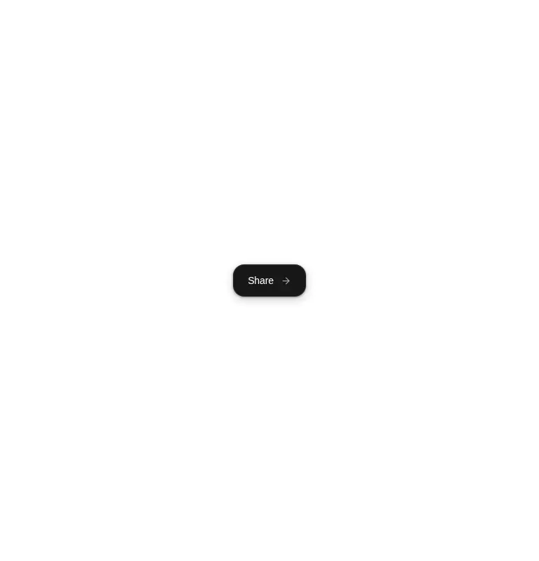
Measured
Every value below was written by the harness on the run that produced the frames above. None of it is derived from the prose.
| Build | OK |
|---|---|
| Mount | OK |
| Console errors | 0 |
| Uncaught page errors | 0 |
| Horizontal overflow | clean at 375, 768, 1440 |
| Axe critical | 0 |
| Axe serious | 0 |
| Axe moderate | 0 |
| Axe minor | 0 |
| Gzip marginal | 61.5 KB (126.9 KB build, 65.4 KB baseline) |
| Bare mode | OK |
| Provider required | NO |
| Demo used | written from the component source API |
Verdict
A polished interaction shell with clean verified behavior, but not a complete sharing feature. It is a good fit when the host app owns the real actions and values the morphing choreography; otherwise, a native share API wrapper or simpler menu will be more practical.
Use it if
- You want a compact share menu that expands in place instead of opening a popover.
- Your product can supply the clipboard, email, and social-sharing behavior through the callback.
- Motion is already acceptable in your client bundle and the dark neutral styling suits the surrounding interface.
Skip it if
- You need working clipboard, mail, or social actions out of the box, because the component only reports the selected target.
- You need native share-sheet behavior or automatic target detection on mobile devices.
- You want a lightweight static button and cannot justify adding Motion for one interaction.
- Your interface cannot accommodate a dark, fixed-target control without restyling its embedded utility classes.
Install
| Declared dependencies | motion |
|---|---|
| Missing on install | none |
| Bare install | builds and mounts without the shadcn-style helpers |
| Provider | no provider required in the harness |
In a non-shadcn project, add Motion, place the TSX file in a client-rendered React area, and provide the utility CSS setup or replace the classes with local styles. Wire the onShare callback to clipboard, email, and X actions, including error handling and truthful confirmation feedback.
Source and credit
This page is a review, not a copy. The component source lives with its author and this site does not republish it. Read the license before you use anything.
Author repository
github.com/ruixenui/ruixen.comAlternatives
Other published entries for the button pattern, ordered by what they measured: mounts first, then clean axe scans, then bare-mode passes, then the smaller bundle.
- neu-buttonneumorphism
- Renders
- YES
- A11y
- 0
- Gzip
- 17.8KB
- Bare
- pass
- Prov
- NO
- clay-buttonclaymorphism
- Renders
- YES
- A11y
- 0
- Gzip
- 18.2KB
- Bare
- pass
- Prov
- NO
- tripled-animated-radio-shadcnuiminimal-flat
- Renders
- YES
- A11y
- 0
- Gzip
- 58.2KB
- Bare
- pass
- Prov
- NO
- ruixen-glow-link-buttonliquid-glass
- Renders
- YES
- A11y
- 0
- Gzip
- 58.9KB
- Bare
- pass
- Prov
- NO
- tripled-mood-gradient-button-shadcnuigradient-glow
- Renders
- YES
- A11y
- 0
- Gzip
- 59.2KB
- Bare
- pass
- Prov
- NO
- ruixen-glass-ai-cardliquid-glass
- Renders
- YES
- A11y
- 0
- Gzip
- 59.5KB
- Bare
- pass
- Prov
- NO