Measured entry
ruixen-slide-to-delete-button
buttonliquid-glassmotion on file
A client-side React confirmation control that requires a deliberate horizontal drag before calling its delete callback. It ships as source through a shadcn registry, embeds its own light and dark CSS, uses Motion for dragging and transforms, and can optionally synthesize a confirmation tick through the browser audio API.

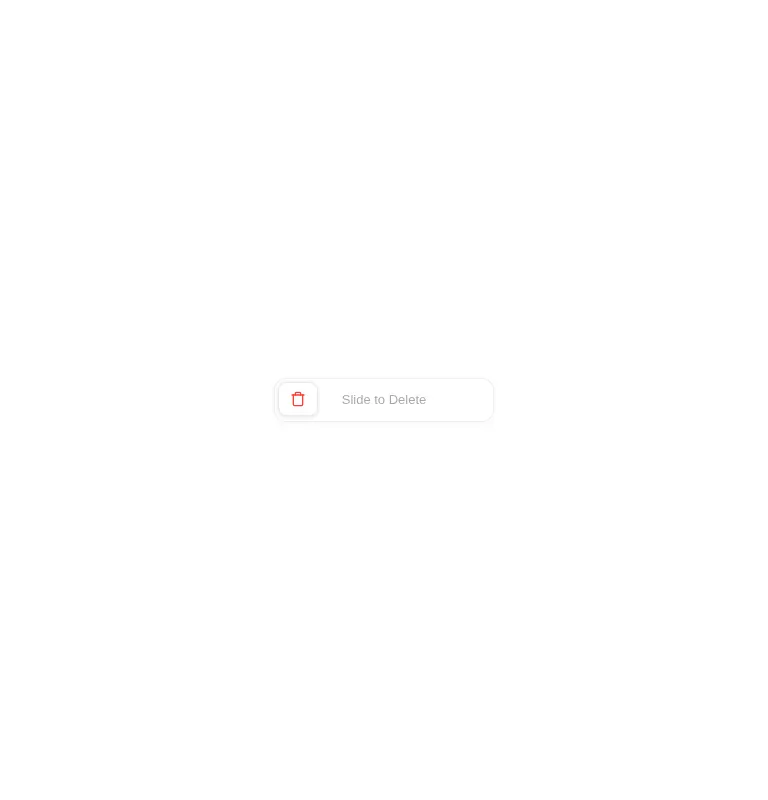
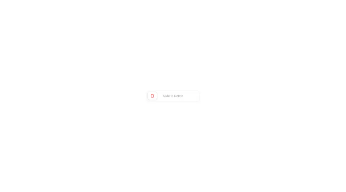
Measured
Every value below was written by the harness on the run that produced the frames above. None of it is derived from the prose.
| Build | OK |
|---|---|
| Mount | OK |
| Console errors | 0 |
| Uncaught page errors | 0 |
| Horizontal overflow | clean at 375, 768, 1440 |
| Axe critical | 0 |
| Axe serious | 0 |
| Axe moderate | 0 |
| Axe minor | 0 |
| Gzip marginal | 62.4 KB (127.9 KB build, 65.5 KB baseline) |
| Bare mode | OK |
| Provider required | NO |
| Demo used | written from the component source API |
Verdict
A focused pointer interaction that builds and mounts without framework scaffolding, but it is not ready as the sole control for a serious delete flow. Add keyboard and assistive-technology behavior, async outcome handling, and investigate the blank wider captures before shipping it.
Use it if
- You want extra friction before a destructive action on a pointer-first interface.
- Your product can use a fixed-width control with a liquid-glass treatment.
- You want customizable idle and confirmed labels plus an optional sound cue.
Skip it if
- The destructive action must be fully operable by keyboard or exposed with native button semantics.
- You need loading, failure, retry, or reset states after the confirmation callback runs.
- You want to avoid adding Motion for a single interaction.
- You need confidence from the supplied captures at every tested viewport, since the wider captures were blank.
Install
| Declared dependencies | motion |
|---|---|
| Missing on install | none |
| Bare install | builds and mounts without the shadcn-style helpers |
| Provider | no provider required in the harness |
In a non-shadcn React project, install Motion, copy the client component, and connect its confirmation callback to your deletion flow. Its styles and icon are embedded, so it needs no utility CSS setup or provider. Add your own accessible keyboard alternative and error handling.
Source and credit
This page is a review, not a copy. The component source lives with its author and this site does not republish it. Read the license before you use anything.
Author repository
github.com/ruixenui/ruixen.comAlternatives
Other published entries for the button pattern, ordered by what they measured: mounts first, then clean axe scans, then bare-mode passes, then the smaller bundle.
- neu-buttonneumorphism
- Renders
- YES
- A11y
- 0
- Gzip
- 17.8KB
- Bare
- pass
- Prov
- NO
- clay-buttonclaymorphism
- Renders
- YES
- A11y
- 0
- Gzip
- 18.2KB
- Bare
- pass
- Prov
- NO
- tripled-animated-radio-shadcnuiminimal-flat
- Renders
- YES
- A11y
- 0
- Gzip
- 58.2KB
- Bare
- pass
- Prov
- NO
- ruixen-glow-link-buttonliquid-glass
- Renders
- YES
- A11y
- 0
- Gzip
- 58.9KB
- Bare
- pass
- Prov
- NO
- tripled-mood-gradient-button-shadcnuigradient-glow
- Renders
- YES
- A11y
- 0
- Gzip
- 59.2KB
- Bare
- pass
- Prov
- NO
- ruixen-glass-ai-cardliquid-glass
- Renders
- YES
- A11y
- 0
- Gzip
- 59.5KB
- Bare
- pass
- Prov
- NO