Measured entry
ruixen-sliding-pagination
navbarunclassifiedmotion on file
A client-side React pagination control shipped as a shadcn registry component. It renders a compact page window with a spring-animated active pill, supports click, arrow-key, and wheel navigation, and can play Web Audio ticks. Its only declared package dependency is Motion, while its styling is embedded in the component.

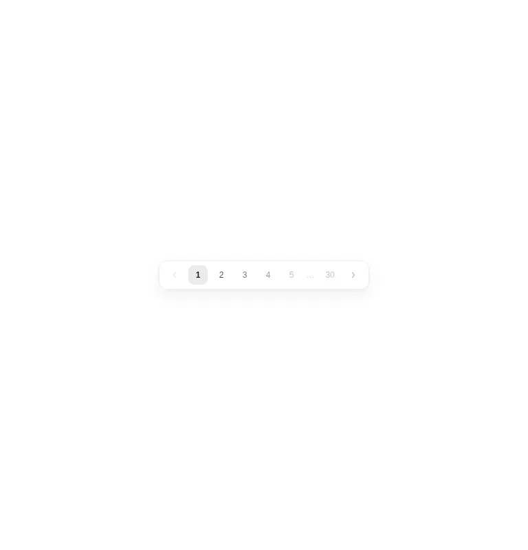
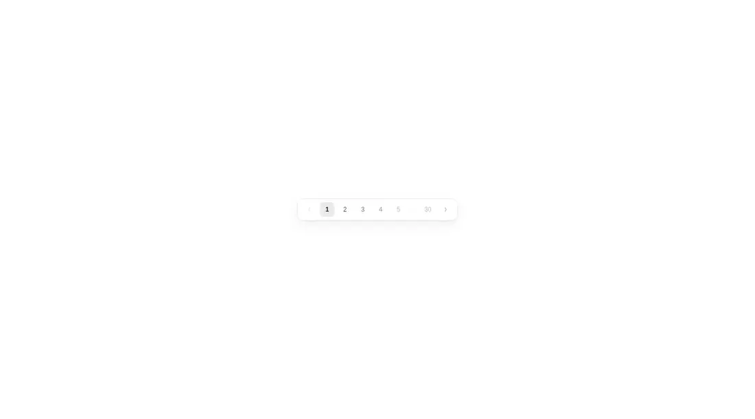
Measured
Every value below was written by the harness on the run that produced the frames above. None of it is derived from the prose.
| Build | OK |
|---|---|
| Mount | OK |
| Console errors | 0 |
| Uncaught page errors | 0 |
| Horizontal overflow | clean at 375, 768, 1440 |
| Axe critical | 1 |
| Axe serious | 1 |
| Axe moderate | 0 |
| Axe minor | 0 |
| Gzip marginal | 62.4 KB (127.9 KB build, 65.5 KB baseline) |
| Bare mode | OK |
| Provider required | NO |
| Demo used | written from the component source API |
Verdict
It builds and mounts without framework scaffolding, and the interaction model is polished enough for a prototype. Do not ship it unchanged: label the arrow controls, expose the current page semantically, raise muted-text contrast, and investigate the wider-view blank flags.
Use it if
- You want a compact numbered paginator that keeps the first and last pages visible.
- Your interface benefits from controlled or uncontrolled page state with a page-change callback.
- You are prepared to repair the navigation labels and contrast before production use.
Skip it if
- You need an accessible paginator that can ship unchanged, because the arrow buttons lack discernible names and some text fails contrast checks.
- You need dependable rendering across wider viewport checks without investigating the reported blank states.
- You want to avoid a runtime animation dependency or do not want wheel gestures captured by pagination.
- Your product requires semantic pagination landmarks and explicit current-page state out of the box.
Install
| Declared dependencies | motion |
|---|---|
| Missing on install | none |
| Bare install | builds and mounts without the shadcn-style helpers |
| Provider | no provider required in the harness |
In a non-shadcn React project, copy the client component, install Motion, and ensure the browser bundle supports Web Audio if sound remains enabled. No shadcn primitives, utility CSS setup, or provider is required because the component embeds its own styles. Add accessible labels and current-page semantics during integration.
Source and credit
This page is a review, not a copy. The component source lives with its author and this site does not republish it. Read the license before you use anything.
Author repository
github.com/ruixenui/ruixen.comAlternatives
Other published entries for the navbar pattern, ordered by what they measured: mounts first, then clean axe scans, then bare-mode passes, then the smaller bundle.
- hyperui-headers-4editorial
- Renders
- YES
- A11y
- 0
- Gzip
- 19.1KB
- Bare
- pass
- Prov
- NO
- kibo-dialog-stackminimal-flat
- Renders
- YES
- A11y
- 0
- Gzip
- 33.4KB
- Bare
- pass
- Prov
- NO
- ruixen-floating-navbarunclassified
- Renders
- YES
- A11y
- 0
- Gzip
- 59.9KB
- Bare
- pass
- Prov
- NO
- ruixen-hover-gradient-navbargradient-glow
- Renders
- YES
- A11y
- 0
- Gzip
- 60.9KB
- Bare
- pass
- Prov
- NO
- ruixen-expandable-menu-navbarunclassified
- Renders
- YES
- A11y
- 0
- Gzip
- 61.8KB
- Bare
- pass
- Prov
- NO
- hextaui-cardminimal-flat
- Renders
- YES
- A11y
- 0
- Gzip
- 26.7KB
- Bare
- fail
- Prov
- NO