Measured entry
ruixen-stack-pagination
navbarunclassifiedmotion on file
A client-side React paginator presented as a layered card stack. It ships as a shadcn registry component but is self-contained, using inline styles and embedded theme CSS. It depends on Motion for spring transitions and can use the browser Web Audio API for an optional navigation tick; it needs no provider.
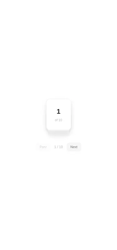
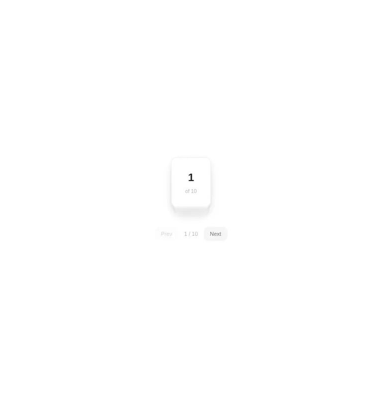
Measured
Every value below was written by the harness on the run that produced the frames above. None of it is derived from the prose.
| Build | OK |
|---|---|
| Mount | OK |
| Console errors | 0 |
| Uncaught page errors | 0 |
| Horizontal overflow | clean at 375, 768, 1440 |
| Axe critical | 0 |
| Axe serious | 1 |
| Axe moderate | 0 |
| Axe minor | 0 |
| Gzip marginal | 60.9 KB (126.3 KB build, 65.4 KB baseline) |
| Bare mode | OK |
| Provider required | NO |
| Demo used | written from the component source API |
Verdict
A polished interaction concept that builds and mounts cleanly without framework glue, but it is better suited to expressive demos or small page sets than core navigation. Fix the verified contrast issue and add stronger pagination semantics before production use.
Use it if
- You want a compact, animated page control with a distinctive stacked-card presentation.
- Your paging state can be driven from a page count and an onChange callback.
- Click and arrow-key navigation cover the interaction model your product needs.
Skip it if
- You need semantic page links, URL navigation, or direct selection of an arbitrary page.
- Your accessibility gate cannot accept the current low-contrast labels and controls.
- You need a minimal paginator without an animation dependency or optional browser audio behavior.
- You require explicit current-page and control labels for screen-reader users out of the box.
Install
| Declared dependencies | motion |
|---|---|
| Missing on install | none |
| Bare install | builds and mounts without the shadcn-style helpers |
| Provider | no provider required in the harness |
In a non-shadcn React project, copy the component into the source tree, install Motion, and ensure the build supports client components, TypeScript JSX, and browser APIs. Keep it client-only if the app renders on the server. Disable sound if audio feedback is not appropriate.
Source and credit
This page is a review, not a copy. The component source lives with its author and this site does not republish it. Read the license before you use anything.
Author repository
github.com/ruixenui/ruixen.comAlternatives
Other published entries for the navbar pattern, ordered by what they measured: mounts first, then clean axe scans, then bare-mode passes, then the smaller bundle.
- hyperui-headers-4editorial
- Renders
- YES
- A11y
- 0
- Gzip
- 19.1KB
- Bare
- pass
- Prov
- NO
- kibo-dialog-stackminimal-flat
- Renders
- YES
- A11y
- 0
- Gzip
- 33.4KB
- Bare
- pass
- Prov
- NO
- ruixen-floating-navbarunclassified
- Renders
- YES
- A11y
- 0
- Gzip
- 59.9KB
- Bare
- pass
- Prov
- NO
- ruixen-hover-gradient-navbargradient-glow
- Renders
- YES
- A11y
- 0
- Gzip
- 60.9KB
- Bare
- pass
- Prov
- NO
- ruixen-expandable-menu-navbarunclassified
- Renders
- YES
- A11y
- 0
- Gzip
- 61.8KB
- Bare
- pass
- Prov
- NO
- hextaui-cardminimal-flat
- Renders
- YES
- A11y
- 0
- Gzip
- 26.7KB
- Bare
- fail
- Prov
- NO