Measured entry
ruixen-wheel-pagination
navbarunclassifiedmotion on file
A client-side React paginator styled as a vertical wheel, with arrow controls, pointer-wheel navigation, animated page changes, and optional audio ticks. It ships as a registry component with its styles embedded, depends on Motion for React, and uses the browser Web Audio API when sound is enabled.
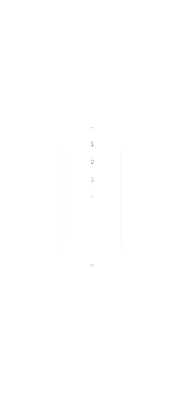
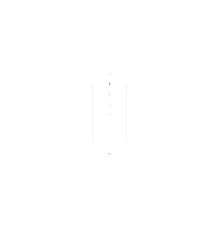

Measured
Every value below was written by the harness on the run that produced the frames above. None of it is derived from the prose.
| Build | OK |
|---|---|
| Mount | OK |
| Console errors | 0 |
| Uncaught page errors | 0 |
| Horizontal overflow | clean at 375, 768, 1440 |
| Axe critical | 1 |
| Axe serious | 0 |
| Axe moderate | 0 |
| Axe minor | 0 |
| Gzip marginal | 63.9 KB (129.4 KB build, 65.5 KB baseline) |
| Bare mode | OK |
| Provider required | NO |
| Demo used | written from the component source API |
Verdict
Treat it as a visual prototype rather than a drop-in paginator. It builds, mounts, and renders at every tested viewport without a shadcn setup, but its default light styling is very low contrast. It also has a critical accessible-name failure on its arrow buttons, while its clickable page choices need keyboard semantics.
Use it if
- You need compact sequential pagination and can accommodate a vertical control.
- You want animated page transitions and pointer-wheel navigation as deliberate parts of the interaction.
- You can connect its change callback to your own routing or data state and finish the accessibility work.
Skip it if
- You need strong out-of-the-box contrast, because the default light palette renders the inactive numbers and frame very faintly.
- You need accessible pagination out of the box, because the arrow buttons lack accessible names and the clickable page choices are not keyboard controls.
- You need semantic page links, direct page entry, or clear first and last navigation.
- Capturing the pointer wheel or creating browser-generated audio would conflict with your page behavior.
Install
| Declared dependencies | motion |
|---|---|
| Missing on install | none |
| Bare install | builds and mounts without the shadcn-style helpers |
| Provider | no provider required in the harness |
In a non-shadcn React project, add Motion and place the component in a client-rendered module. No utility CSS setup or provider is required because its styles are embedded. Wire the change callback to application state, label the arrow buttons, convert page choices to keyboard-operable controls, increase the visual contrast, and verify the result in your app.
Source and credit
This page is a review, not a copy. The component source lives with its author and this site does not republish it. Read the license before you use anything.
Author repository
github.com/ruixenui/ruixen.comAlternatives
Other published entries for the navbar pattern, ordered by what they measured: mounts first, then clean axe scans, then bare-mode passes, then the smaller bundle.
- hyperui-headers-4editorial
- Renders
- YES
- A11y
- 0
- Gzip
- 19.1KB
- Bare
- pass
- Prov
- NO
- kibo-dialog-stackminimal-flat
- Renders
- YES
- A11y
- 0
- Gzip
- 33.4KB
- Bare
- pass
- Prov
- NO
- ruixen-floating-navbarunclassified
- Renders
- YES
- A11y
- 0
- Gzip
- 59.9KB
- Bare
- pass
- Prov
- NO
- ruixen-hover-gradient-navbargradient-glow
- Renders
- YES
- A11y
- 0
- Gzip
- 60.9KB
- Bare
- pass
- Prov
- NO
- ruixen-expandable-menu-navbarunclassified
- Renders
- YES
- A11y
- 0
- Gzip
- 61.8KB
- Bare
- pass
- Prov
- NO
- hextaui-cardminimal-flat
- Renders
- YES
- A11y
- 0
- Gzip
- 26.7KB
- Bare
- fail
- Prov
- NO