Measured entry
tripled-command-palette-shadcnui
navbarminimal-flatmotion on file
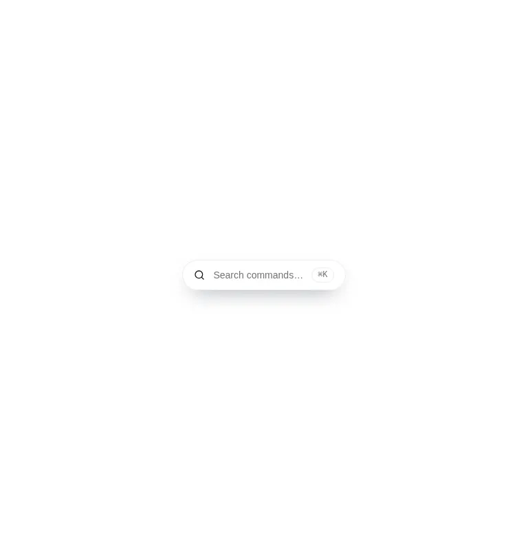
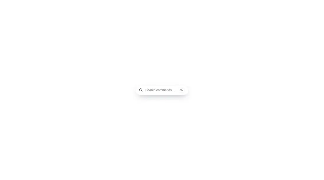
An animated command-palette shell shipped as a client-side React registry component. It provides a search trigger, modal overlay, label filtering, empty state, motion-reduction support, and static command rows. It relies on Framer Motion, Lucide icons, Tailwind utility classes, and shadcn-style theme tokens; actions and global keyboard handling are left to the adopter.

Measured
Every value below was written by the harness on the run that produced the frames above. None of it is derived from the prose.
| Build | OK |
|---|---|
| Mount | OK |
| Console errors | 0 |
| Uncaught page errors | 0 |
| Horizontal overflow | clean at 375, 768, 1440 |
| Axe critical | 0 |
| Axe serious | 0 |
| Axe moderate | 0 |
| Axe minor | 0 |
| Gzip marginal | 62.8 KB (128.2 KB build, 65.4 KB baseline) |
| Bare mode | FAIL |
| Provider required | NO |
| Demo used | written from the component source API |
What the harness recorded
BARE BUILD
✗ Build failed in 1.03s
error during build:
[vite]: Rollup failed to resolve import "lucide-react" from "<sandbox>re-18d12343aa17/src/cut/components/uitripled/command-palette-shadcnui.tsx".
Verdict
A credible visual starting point, but it is closer to an animated demo than a finished command palette. The trigger advertises a shortcut that is not wired, result buttons do nothing, and keyboard navigation is absent. Choose it when the look saves time and you can supply the interaction layer.
Use it if
- You need a polished launcher mockup and are prepared to connect every command to real behavior.
- Your interface already uses Tailwind utilities and token-based shadcn styling.
- You want animated open, close, and result transitions that respect reduced-motion preferences.
Skip it if
- You need a complete command system with a working global shortcut, arrow-key navigation, selection, and action callbacks.
- You want a lightweight search control without an animation runtime and icon dependency.
- Your design system does not expose the Tailwind utilities and theme tokens used throughout the component.
- You need robust dialog behavior such as focus trapping and Escape-key dismissal without adding it yourself.
Install
| Declared dependencies | framer-motion, react, radix-ui |
|---|---|
| Missing on install | none |
| Bare install | fails once the shadcn-style helpers are removed, so it needs that setup |
| Provider | no provider required in the harness |
In a non-shadcn project, add React, Framer Motion, Lucide React, and a Tailwind setup that supports the utilities in the source. Define compatible background, card, border, primary, and muted-foreground theme tokens, include the screen-reader-only utility, then add focus management, keyboard listeners, and command callbacks.
Source and credit
This page is a review, not a copy. The component source lives with its author and this site does not republish it. Read the license before you use anything.
Author repository
github.com/moumen-soliman/uitripledAlternatives
Other published entries for the navbar pattern, ordered by what they measured: mounts first, then clean axe scans, then bare-mode passes, then the smaller bundle.
- hyperui-headers-4editorial
- Renders
- YES
- A11y
- 0
- Gzip
- 19.1KB
- Bare
- pass
- Prov
- NO
- kibo-dialog-stackminimal-flat
- Renders
- YES
- A11y
- 0
- Gzip
- 33.4KB
- Bare
- pass
- Prov
- NO
- ruixen-floating-navbarunclassified
- Renders
- YES
- A11y
- 0
- Gzip
- 59.9KB
- Bare
- pass
- Prov
- NO
- ruixen-hover-gradient-navbargradient-glow
- Renders
- YES
- A11y
- 0
- Gzip
- 60.9KB
- Bare
- pass
- Prov
- NO
- ruixen-expandable-menu-navbarunclassified
- Renders
- YES
- A11y
- 0
- Gzip
- 61.8KB
- Bare
- pass
- Prov
- NO
- hextaui-cardminimal-flat
- Renders
- YES
- A11y
- 0
- Gzip
- 26.7KB
- Bare
- fail
- Prov
- NO