Measured entry
tripled-fluid-modal-transition-shadcnui
dialogminimal-flatmotion on file
A client-side React modal shipped as a shadcn registry component. It manages its own open state and uses Framer Motion for the backdrop, spring entrance, exit, and close-button interaction. Styling relies on Tailwind utilities and shadcn theme tokens, while the close icon comes from Lucide React; the listed button registry dependency is not used by the component source.
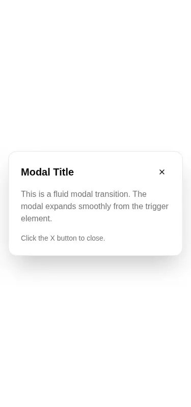
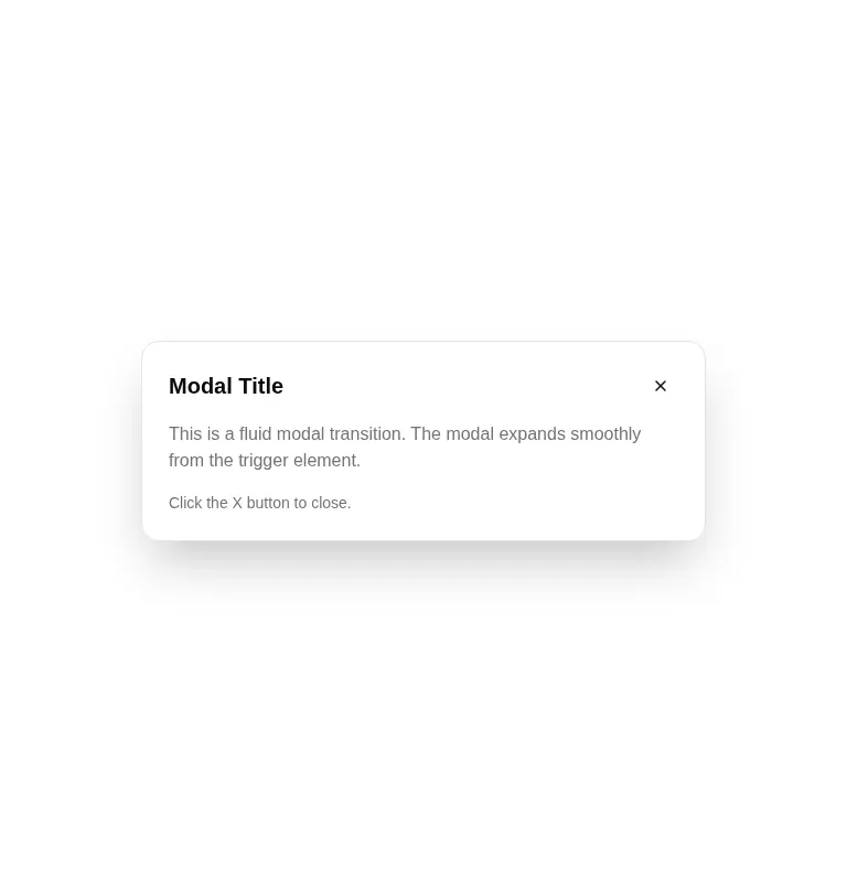
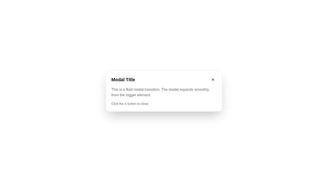
Measured
Every value below was written by the harness on the run that produced the frames above. None of it is derived from the prose.
| Build | OK |
|---|---|
| Mount | OK |
| Console errors | 0 |
| Uncaught page errors | 0 |
| Horizontal overflow | clean at 375, 768, 1440 |
| Axe critical | 1 |
| Axe serious | 0 |
| Axe moderate | 0 |
| Axe minor | 0 |
| Gzip marginal | 60.6 KB (126.0 KB build, 65.4 KB baseline) |
| Bare mode | FAIL |
| Provider required | NO |
| Demo used | written from the component source API |
What the harness recorded
BARE BUILD
✗ Build failed in 985ms
error during build:
[vite]: Rollup failed to resolve import "lucide-react" from "<sandbox>re-f378227ad4ea/src/cut/components/uitripled/fluid-modal-transition-shadcnui.tsx".
Verdict
The animation and responsive mounting work, but this is a visual modal shell rather than a production-ready dialog. Use it as a starting point only if you will add an accessible name, dialog semantics, keyboard handling, focus trapping, focus return, and safer instance-specific motion identifiers.
Use it if
- You want a compact, self-contained animated modal whose title, trigger, and body can be supplied as React content.
- Your application already uses Tailwind theme tokens and Framer Motion, and you can finish the dialog accessibility behavior.
- You need a modal that renders without a context provider and closes by backdrop click or its icon control.
Skip it if
- You need an accessible dialog out of the box: the close control has no accessible name, and the component lacks dialog semantics and focus management.
- You need keyboard dismissal, focus return, scroll locking, or other production-grade modal behavior without adding it yourself.
- You want a lightweight dialog without taking on Framer Motion and Lucide React.
- You plan to render multiple instances without revising the shared motion layout identifier.
Install
| Declared dependencies | framer-motion, react, radix-ui |
|---|---|
| Missing on install | none |
| Bare install | fails once the shadcn-style helpers are removed, so it needs that setup |
| Provider | no provider required in the harness |
In a non-shadcn project, add React, Framer Motion, and Lucide React, configure Tailwind, and map the background, card, border, primary, foreground, and muted design tokens used by the classes. No provider is required. The advertised shadcn button dependency can be omitted unless your surrounding implementation uses it.
Source and credit
This page is a review, not a copy. The component source lives with its author and this site does not republish it. Read the license before you use anything.
Author repository
github.com/moumen-soliman/uitripledAlternatives
Other published entries for the dialog pattern, ordered by what they measured: mounts first, then clean axe scans, then bare-mode passes, then the smaller bundle.
- shadcn-dialogunclassified
- Renders
- YES
- A11y
- 0
- Gzip
- 26.7KB
- Bare
- fail
- Prov
- NO
- 8bitcn-dialogueskeuomorphism
- Renders
- YES
- A11y
- 0
- Gzip
- 34.2KB
- Bare
- fail
- Prov
- NO
- neobrutalism-dialogbrutalism
- Renders
- YES
- A11y
- 0
- Gzip
- 40.5KB
- Bare
- fail
- Prov
- NO
- neobrutalism-ndialogbrutalism
- Renders
- YES
- A11y
- 0
- Gzip
- 40.5KB
- Bare
- fail
- Prov
- NO
- neobrutalism-alert-dialogbrutalism
- Renders
- YES
- A11y
- 0
- Gzip
- 40.7KB
- Bare
- fail
- Prov
- NO
- shadcn-alert-dialogunclassified
- Renders
- YES
- A11y
- 0
- Gzip
- 41.5KB
- Bare
- fail
- Prov
- NO