Measured entry
tripled-gallery-grid-block-shadcnui
navbarminimal-flatmotion on file
A client-side portfolio gallery shipped as a shadcn registry block, despite being queued as a navbar. It provides category filters, animated grid transitions, and a lightbox with previous and next controls. It depends on React, Framer Motion, Lucide icons, Tailwind theme classes, and shadcn Badge, Button, and Card primitives.
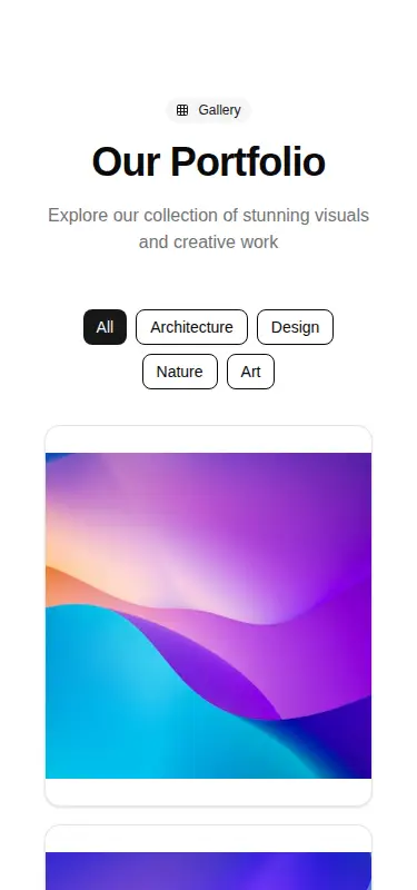
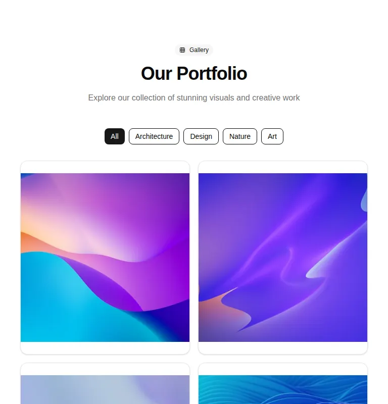
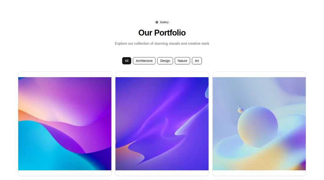
Measured
Every value below was written by the harness on the run that produced the frames above. None of it is derived from the prose.
| Build | OK |
|---|---|
| Mount | OK |
| Console errors | 0 |
| Uncaught page errors | 0 |
| Horizontal overflow | clean at 375, 768, 1440 |
| Axe critical | 0 |
| Axe serious | 0 |
| Axe moderate | 1 |
| Axe minor | 0 |
| Gzip marginal | 73.2 KB (138.6 KB build, 65.4 KB baseline) |
| Bare mode | FAIL |
| Provider required | NO |
| Demo used | written from the component source API |
What the harness recorded
BARE BUILD
✗ Build failed in 1m 8s
error during build:
[vite:load-fallback] Could not load <sandbox>/src/lib/utils (imported by src/components/ui/button.tsx): ENOENT: no such file or directory, open '<sandbox>/src/lib/utils'
Verdict
A polished gallery starter with responsive layout, useful filtering, and a working animated viewer. It needs a shadcn-style setup and should not be treated as drop-in code for a bare React app. Fix the duplicated landmark naming and strengthen dialog keyboard and focus behavior before production use.
Use it if
- You need a compact portfolio or project gallery with built-in category filtering.
- Your app already uses shadcn primitives, Tailwind theme tokens, and Framer Motion.
- You want keyboard-activatable gallery cards and a modal-style image viewer as a starting point.
Skip it if
- You are actually looking for navigation UI, since this component is a gallery rather than a navbar.
- You need a production-ready accessible lightbox with focus trapping, focus restoration, and Escape-key handling.
- You need lightbox navigation to remain within the active category, because its controls traverse the full image set.
- You want to avoid shipping an animation dependency for a relatively simple gallery.
Install
| Declared dependencies | framer-motion, react, radix-ui |
|---|---|
| Missing on install | none |
| Bare install | fails once the shadcn-style helpers are removed, so it needs that setup |
| Provider | no provider required in the harness |
In a non-shadcn project, add Tailwind with the expected theme tokens and path alias, provide the shared class-name utility, install React, Framer Motion, Lucide React, and the Radix dependencies used by the UI primitives, then add compatible Badge, Button, and Card components. The bare build fails because Button imports the missing shared utility module.
Source and credit
This page is a review, not a copy. The component source lives with its author and this site does not republish it. Read the license before you use anything.
Author repository
github.com/moumen-soliman/uitripledAlternatives
Other published entries for the navbar pattern, ordered by what they measured: mounts first, then clean axe scans, then bare-mode passes, then the smaller bundle.
- hyperui-headers-4editorial
- Renders
- YES
- A11y
- 0
- Gzip
- 19.1KB
- Bare
- pass
- Prov
- NO
- kibo-dialog-stackminimal-flat
- Renders
- YES
- A11y
- 0
- Gzip
- 33.4KB
- Bare
- pass
- Prov
- NO
- ruixen-floating-navbarunclassified
- Renders
- YES
- A11y
- 0
- Gzip
- 59.9KB
- Bare
- pass
- Prov
- NO
- ruixen-hover-gradient-navbargradient-glow
- Renders
- YES
- A11y
- 0
- Gzip
- 60.9KB
- Bare
- pass
- Prov
- NO
- ruixen-expandable-menu-navbarunclassified
- Renders
- YES
- A11y
- 0
- Gzip
- 61.8KB
- Bare
- pass
- Prov
- NO
- hextaui-cardminimal-flat
- Renders
- YES
- A11y
- 0
- Gzip
- 26.7KB
- Bare
- fail
- Prov
- NO