Measured entry
hextaui-tooltip
tooltipminimal-flatmotion on file
A client-side React tooltip wrapper shipped as a shadcn registry TSX file. It composes Radix Tooltip primitives, creates its own provider around each root, and styles the content and arrow with Tailwind classes. Its cn helper relies on clsx and tailwind-merge.
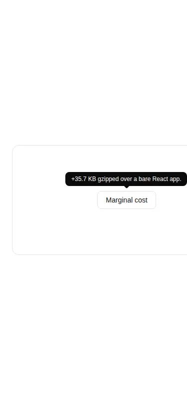


Measured
Every value below was written by the harness on the run that produced the frames above. None of it is derived from the prose.
| Build | OK |
|---|---|
| Mount | OK |
| Console errors | 0 |
| Uncaught page errors | 0 |
| Horizontal overflow | flagged at 375 |
| Axe critical | 0 |
| Axe serious | 0 |
| Axe moderate | 0 |
| Axe minor | 0 |
| Gzip marginal | 48.6 KB (114.1 KB build, 65.5 KB baseline) |
| Bare mode | OK |
| Provider required | NO |
| Demo used | written from the component source API |
Verdict
A sound Radix-based tooltip with clean wrappers, built-in provider context, successful mounting, and no detected accessibility violations. It is a sensible fit for Tailwind component libraries, but the narrow-screen overflow in the tested example deserves a responsive demo adjustment.
Use it if
- You want hover and keyboard-focus hints backed by Radix positioning and accessibility behavior.
- Your React app already uses Tailwind utilities and a shadcn-style cn helper.
- You prefer each tooltip root to provide its own Radix context without wiring a provider at the app shell.
Skip it if
- Your project does not use Tailwind or shadcn-style utility conventions and you do not want to translate the styling.
- You need the tested example to fit narrow screens unchanged, since that viewport showed horizontal overflow.
- The content is essential or interactive and should remain visible without hover or focus.
- You want to avoid adding Radix Tooltip and the class-merging utilities for a small hint.
Install
| Declared dependencies | @radix-ui/react-tooltip, clsx, tailwind-merge |
|---|---|
| Missing on install | none |
| Bare install | builds and mounts without the shadcn-style helpers |
| Provider | no provider required in the harness |
In a non-shadcn React project, add Radix Tooltip, clsx, and tailwind-merge; provide a cn class-merging helper or replace that import; configure Tailwind to scan the file; and define the foreground and background theme utilities plus the referenced animation utilities. Preserve the client-component directive in frameworks that distinguish server and client components.
Source and credit
This page is a review, not a copy. The component source lives with its author and this site does not republish it. Read the license before you use anything.
Author repository
github.com/preetsuthar17/HextaUIAlternatives
Other published entries for the tooltip pattern, ordered by what they measured: mounts first, then clean axe scans, then bare-mode passes, then the smaller bundle.
- shadcn-tooltipunclassified
- Renders
- YES
- A11y
- 0
- Gzip
- 31.1KB
- Bare
- fail
- Prov
- NO
- shadcn-hover-cardunclassified
- Renders
- YES
- A11y
- 0
- Gzip
- 43.4KB
- Bare
- fail
- Prov
- NO
- neobrutalism-hover-cardbrutalism
- Renders
- YES
- A11y
- 0
- Gzip
- 43.6KB
- Bare
- fail
- Prov
- NO
- neobrutalism-ntooltipbrutalism
- Renders
- YES
- A11y
- 0
- Gzip
- 44.6KB
- Bare
- fail
- Prov
- NO
- neobrutalism-tooltipbrutalism
- Renders
- YES
- A11y
- 0
- Gzip
- 44.6KB
- Bare
- fail
- Prov
- NO
- originui-comp-99minimal-flat
- Renders
- YES
- A11y
- 0
- Gzip
- 46.7KB
- Bare
- fail
- Prov
- NO