Measured entry
neobrutalism-hover-card
A client-side React hover card shipped as a shadcn registry source file, not a packaged black box. It wraps Radix Hover Card primitives and styles the content with Tailwind utilities, project theme tokens, animation utilities, and a local cn helper imported through the usual alias.

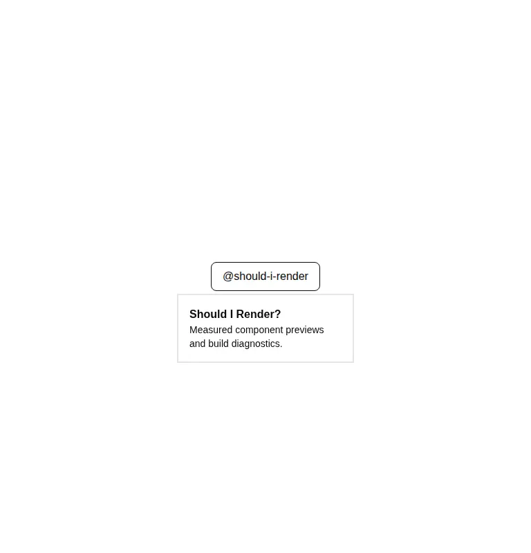
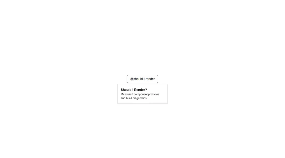
Measured
Every value below was written by the harness on the run that produced the frames above. None of it is derived from the prose.
| Build | OK |
|---|---|
| Mount | OK |
| Console errors | 0 |
| Uncaught page errors | 0 |
| Horizontal overflow | clean at 375, 768, 1440 |
| Axe critical | 0 |
| Axe serious | 0 |
| Axe moderate | 0 |
| Axe minor | 0 |
| Gzip marginal | 43.6 KB (109.0 KB build, 65.4 KB baseline) |
| Bare mode | FAIL |
| Provider required | NO |
| Demo used | written from the component source API |
What the harness recorded
BARE BUILD
✗ Build failed in 31.79s
error during build:
[vite:load-fallback] Could not load <sandbox>/src/lib/utils (imported by src/cut/components/ui/hover-card.tsx): ENOENT: no such file or directory, open '<sandbox>/src/lib/utils'
Verdict
A sound fit for neobrutalist React interfaces already following shadcn conventions. It builds, mounts, stays contained across the tested layouts, and reports no automated accessibility findings, but the bare failure shows it needs a shadcn-style setup rather than a direct copy into an unprepared app.
Use it if
- You need a compact preview panel that appears from a hoverable profile, link, or reference trigger.
- Your app already uses Radix primitives and a shadcn-style Tailwind theme with matching token names.
- You want source-owned markup and styling that can be adjusted directly in the project.
Skip it if
- The content must be reliably available on touch-only interfaces, where hover is not a dependable interaction.
- You only need a short text hint and a simpler tooltip would carry less interaction and dependency weight.
- Your project cannot support Tailwind theme tokens, animation utilities, or the local cn helper expected by this source.
Install
| Declared dependencies | @radix-ui/react-hover-card |
|---|---|
| Missing on install | none |
| Bare install | fails once the shadcn-style helpers are removed, so it needs that setup |
| Provider | no provider required in the harness |
In a non-shadcn project, add the Radix Hover Card dependency, provide the cn class-merging helper and its import alias, configure Tailwind, define the referenced theme tokens, and include utilities for the state and directional animations. Keep the file in a client-rendered React boundary.
Source and credit
This page is a review, not a copy. The component source lives with its author and this site does not republish it. Read the license before you use anything.
Author repository
github.com/ekmas/neobrutalism-componentsAlternatives
Other published entries for the tooltip pattern, ordered by what they measured: mounts first, then clean axe scans, then bare-mode passes, then the smaller bundle.
- hextaui-tooltipminimal-flat
- Renders
- YES
- A11y
- 0
- Gzip
- 48.6KB
- Bare
- pass
- Prov
- NO
- shadcn-tooltipunclassified
- Renders
- YES
- A11y
- 0
- Gzip
- 31.1KB
- Bare
- fail
- Prov
- NO
- shadcn-hover-cardunclassified
- Renders
- YES
- A11y
- 0
- Gzip
- 43.4KB
- Bare
- fail
- Prov
- NO
- neobrutalism-ntooltipbrutalism
- Renders
- YES
- A11y
- 0
- Gzip
- 44.6KB
- Bare
- fail
- Prov
- NO
- neobrutalism-tooltipbrutalism
- Renders
- YES
- A11y
- 0
- Gzip
- 44.6KB
- Bare
- fail
- Prov
- NO
- originui-comp-99minimal-flat
- Renders
- YES
- A11y
- 0
- Gzip
- 46.7KB
- Bare
- fail
- Prov
- NO