Measured entry
tripled-cash-flow-chart
tooltipminimal-flatmotion on file
An animated cash-flow bar chart shipped as a shadcn registry React client component. It includes monthly and yearly views, focusable bars, hover and keyboard tooltips, reduced-motion handling, and screen-reader summaries. It depends on React, Framer Motion, Tailwind-style theme classes, and a shadcn-style cn utility.
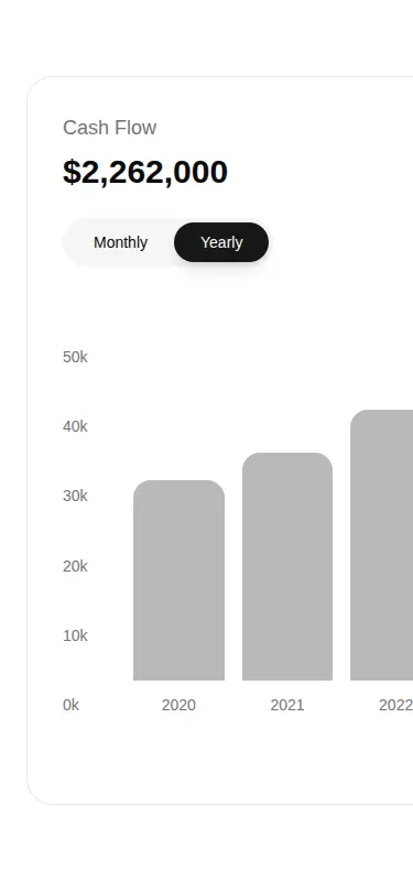
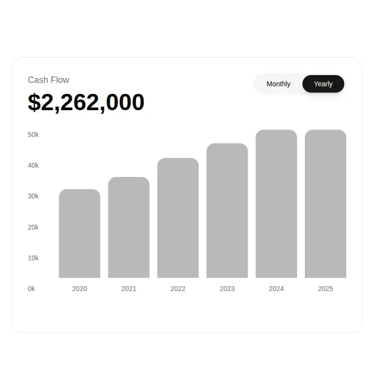
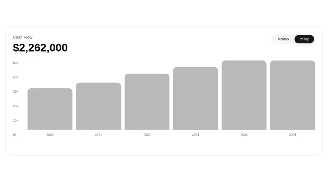
Measured
Every value below was written by the harness on the run that produced the frames above. None of it is derived from the prose.
| Build | OK |
|---|---|
| Mount | OK |
| Console errors | 0 |
| Uncaught page errors | 0 |
| Horizontal overflow | flagged at 375 |
| Axe critical | 0 |
| Axe serious | 0 |
| Axe moderate | 0 |
| Axe minor | 0 |
| Gzip marginal | 70.6 KB (136.0 KB build, 65.4 KB baseline) |
| Bare mode | FAIL |
| Provider required | NO |
| Demo used | written from the component source API |
What the harness recorded
BARE BUILD
✗ Build failed in 1m 58s
error during build:
[vite:load-fallback] Could not load <sandbox>/src/lib/utils (imported by src/cut/@uitripled/react-shadcn/src/components/data/charts/cash-flow-chart.tsx): ENOENT: no such file or directory, open '<sandbox>/src/lib/utils'
Verdict
A credible accessible dashboard chart with useful focus behavior and reduced-motion support, but it is closer to a polished template than a reusable data component. It needs a shadcn-style setup, and teams should plan to expose the embedded data and formatting as props before production use.
Use it if
- You need a dashboard cash-flow card with a built-in period switch and animated bars.
- Keyboard-accessible tooltips and an assistive-technology data table matter for your chart.
- Your app already uses shadcn conventions, Tailwind theme tokens, and Framer Motion.
Skip it if
- You need a chart that accepts live data through props, because the datasets and currency formatting are embedded in the component.
- Your layout must avoid horizontal scrolling on narrow screens.
- You want a lightweight chart without adding Framer Motion or maintaining shadcn-compatible styling utilities.
Install
| Declared dependencies | framer-motion, react |
|---|---|
| Missing on install | none |
| Bare install | fails once the shadcn-style helpers are removed, so it needs that setup |
| Provider | no provider required in the harness |
In a non-shadcn project, add React and Framer Motion, configure Tailwind-compatible utilities and the referenced color and accessibility classes, provide a cn class-merging helper at the expected alias, and ensure client components are supported. Replace the embedded datasets or add props before connecting application data.
Source and credit
This page is a review, not a copy. The component source lives with its author and this site does not republish it. Read the license before you use anything.
Author repository
github.com/moumen-soliman/uitripledAlternatives
Other published entries for the tooltip pattern, ordered by what they measured: mounts first, then clean axe scans, then bare-mode passes, then the smaller bundle.
- hextaui-tooltipminimal-flat
- Renders
- YES
- A11y
- 0
- Gzip
- 48.6KB
- Bare
- pass
- Prov
- NO
- shadcn-tooltipunclassified
- Renders
- YES
- A11y
- 0
- Gzip
- 31.1KB
- Bare
- fail
- Prov
- NO
- shadcn-hover-cardunclassified
- Renders
- YES
- A11y
- 0
- Gzip
- 43.4KB
- Bare
- fail
- Prov
- NO
- neobrutalism-hover-cardbrutalism
- Renders
- YES
- A11y
- 0
- Gzip
- 43.6KB
- Bare
- fail
- Prov
- NO
- neobrutalism-ntooltipbrutalism
- Renders
- YES
- A11y
- 0
- Gzip
- 44.6KB
- Bare
- fail
- Prov
- NO
- neobrutalism-tooltipbrutalism
- Renders
- YES
- A11y
- 0
- Gzip
- 44.6KB
- Bare
- fail
- Prov
- NO